WORK

SAMPLES

Live Green Lexington

Live Green Lexington is the outreach and communications branch of Lexington’s Department of Environmental Quality and Public Works. They are a go-to source for green information and education in the city. As a communication designer for Live Green Lex, I distill confusing topics and translate them visually. Highlighted is a series of educational posts designed to introduce community members to the different divisions and roles in the EQPW department. 

+ Design   
+ Content Strategy
+ Content Design

The Kentucky Center for Grieving Children and Families

KCGCF is a non-profit that supports bereaved children in Kentucky. Kentucky children face higher bereavement rates than nearly every other state. A quarter of the children who lose a parent in Kentucky, lose them to addiction. Leila Salisbury saw a great need for a child-specific grief center in Kentucky and created one in 2021. I created a brand that exemplifies KCGCF’s mission: to support, grieve, and grow. The brand identity and accompanying marketing assets were easily adopted and let her new non-profit make materials quickly.

+ Brand Identity
+ Digital Design   
+ Print Design 

Campaign of Hannah LeGris

Hannah LeGris is serving her second term as Lexington’s District 3 councilmember. With punchy colors and a cool, professional, slightly retro look, the campaign emblem reflects what makes Hannah such a uniquely qualified person to represent Lexington’s 3rd District. The emblem and associated brand assets reflect her creativity, honesty, and dedication. Along with a brand identity, I created many print and digital assets.

+ Brand identity   
+ digital design
+ PRINT DESIGN 
+ Content creation

Community Inspired Lexington

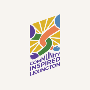
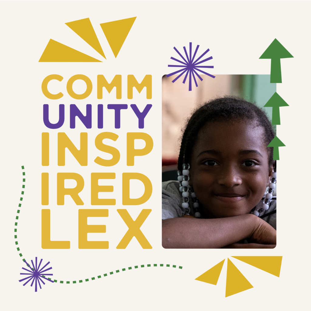
Community Inspired Lexington, formerly Community Inspired Solutions, is a small non-profit serving residents, specifically kids, in North Lexington. A small non-profit in this case, is one woman, Ms. Rebecca. After almost 10 years, Ms. Rebecca wanted a refreshed look that would inspire others the way she feels inspired. With vibrant colors and active design elements, the new visual identity reflects the most important part of CIL: the kids she serves.

+ Brand Identity   
+ Brand Strategy
+ Digital Design  
+ PRINT DESIGN